I take a lot of screenshots. Taking them is an easy thing to do but, if you do a lot of them, processing screenshots can become a time consuming process. For me it usually involves at least this many steps:

  1. Take the screenshot (on a Mac pressing ⌘-shift-4 and dragging the crosshairs over your target will do the trick).
  2. Rename the file to something that makes sense (otherwise it'll be named something like Screen Shot 2016-10-29 at 8.11.27 AM.png
  3. Find the new image file on the desktop and double click it to open in the Preview app.
  4. Use Preview to resize the picture then save the file. On my website I display product images in a way that requires them to be no larger than 150px wide. However, I've been thinking a lot about retina screens lately and I've been starting to collect versions of my images that are twice as large too.
  5. Upload to my server using my FTP client (I use Transmit). This involves navigating about 6 layers deep into my file system.
  6. The point of these screenshots is to display them on my Web site, so the last step is to enter the image name into my database. So, I either have to retype the name I chose for this image or copy and paste it.

Every step is simple. However, when you find yourself repeating a multistep task like this it's time to consider some sort of automation.

The Mac has some great tools for automation. For the super nerdy, bash scripts on the command line, python or ruby scripts (or even php or javascript for that matter) can work wonders. There's also AppleScript, which is supposed to be a layperson's scripting language but, despite all my programming experience, I have a hard time wrapping my head around it.

There's even some absolutely fantastic third party apps like Hazel and Keyboard Maestro. However, a lot of workflow problems like this one can be solved by the simplest automation solution, Automator.

Automator makes automation easy by letting you drag steps into your workflow. These steps are chained together, so each one takes an input (which can be a file, text, or something else) and outputs an, er, an output. Oftentimes this output is the same thing that was input, sometimes it's something different that was created by the step.

Note: To quickly find these actions start typing their names into the search box at the top of the screen. Make sure Library is highlighted in the left column, otherwise you will only be searching a smaller subcategory and you might not find what you're looking for.


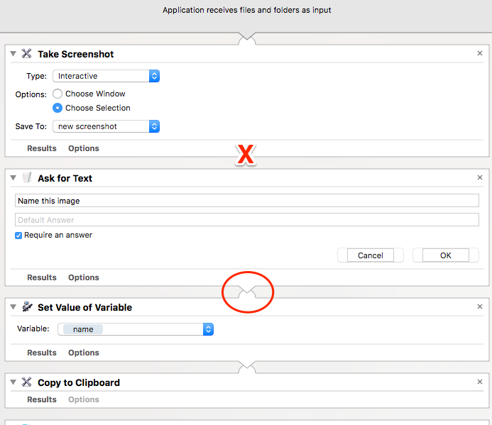
So, this is the workflow that I ended up with. 

The first step is to take the screenshot. I want this to be interactive so that I'll be able to select the exact part of the screen that I want for my screenshot. The other option is to save it to the clipboard or to a location. I first made a folder on my desktop called eyedock lens image and put an image inside of it named new screenshot.png, then I chose the Other option in the Save To: dropdown and navigated to this image.

One thing that I wanted to point out on here is that the steps you drag into automator are usually chained together, meaning that the output of one step is, by default, the input for the next step. This is indicated be the circle in the image above.

However, sometimes we want to break this chain. This is true here. My second step is to ask for some text that will be a name for this picture, which is a step that does not need an image to be passed into it. So, when I added this step I right-clicked on it and chose the Ignore Input option. As you can see (where I put the red 'X' above) there is no visible connection between the steps.

Asking for text will pot up a little dialog box that will ask for some text. I want this to be mandatory so I checked the Require an answer checkbox.

The output of this step is going to be the text that the user types in, and this will become the input for the next step, which is Set value of Variable. I named my variable Name, so now this variable it will equal whatever text the user entered in the above step.

After setting my variable, I chose the Copy to Clipboard  step. This will put the name of my image file on the clipboard so I can just paste it where I want it. This may not be an important step for everyone but it's a helpful one for me.

The next step is Get the specified finder items. This is going to retrieve the screenshot image file that we took in step one. Because this does not require the text from the above steps I once again chose the "Ignore Input" option - we are starting a new chain here. On the Get the specified finder items step I simply clicked the "add" button and navigated to the location of my image file. The output of this step will be the image file, which we're going to pass on to the next step,

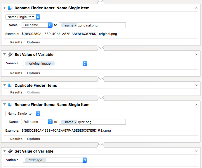
Rename Findere Items: Name Single Item. I'm going to rename the full name of the file, so I selected this option and then I used the variable NameI from our second step and appended the text "_original.png". So, if the user enters the text "myPicture" in step 2 then the file will now be named "myPicture_original.png".

After renaming the file I'm going to set another variable that refers to this file. It's always best to make variable names that make sense, so I called this variable Original Image. 

Then, I duplicate the file. The output from this step will be the duplicated file (not the original), so my next step, Rename Finder Items, will rename this file (otherwise it well be called myPicture_original copy.png). I'm ultimately going to make two copies of this image and this one is going to be twice as big, so I will rename this one with the variable name + "@2x.png". In our example it will be myPicture@2x.png. Lastly, I set this to another variable and, trying to keep things organized, I call it 2xImage.

I'm thinking, at this point, that these steps aren't requiring as much explanation. The "2x" file is duplicated, renamed (this time it will simply be myPicture.png), and stored to another variable (1xImage). In the next step we finally scale the image. For my Web site I place images in a position where I want them to be no larger than 150px, so I select the appropriate options to give that result. This scaling will be done in a way that respects the proportions of the image - it won't turn your image into a 150px x 150px square, it'll just make sure it's not larger than 150px in either dimension.

We created a 2x image, but we haven't scaled it to our desired size yet. So, we're going to get that image and do that now. This is why we assigned a variable to that image earlier - it makes it really easy to retrieve and perform more actions on it. So, our next step is to Get the value of variable "2xImage". Note that I once again selected the "ignore input" option so this step wasn't chained to the ones above it.

Then, we scale the image - I wanted this to be twice as big so I selected 300px this time.

Now, all the images I wanted have been created - the original, the 1x, and the 2x. The last step is to upload them. Unfortunately Automator doesn't have any built in steps to upload files, but any good third party app should provide Automator actions. As I mentioned above I use Transmit and it provides exactly what I need for this step.

So, the next step is to drag in the Upload step and configure it with your server credentials.

After I've uploaded the 2x image, I get the 1x image (via the 1xImage variable) and upload that one too.


And that's it!

Now save the app and name it whatever you want - choose something that make sense, like screenshot uploader. You can activate it like you would any other app (by double clicking it). However, if our goal is to increase efficiency, I'd use an app launcher like Spotlight (hit ⌘-space and start typing screenshot uploader, or whatever you named it). I'd also recommend giving your app a custom icon to make it more recognizable (otherwise all your Automator apps will look the same!).

Here it is in action:

Wrap-up

There's about a 97.6% chance that you don't need the exact same thing that I need here. Hopefully you'll find this helpful, though, and take this and customize it for your own needs. Automator is obviously highly customizable, and there's no right or wrong way to solve a problem. In fact, as I typed this up I thought of a couple ways this workflow could be changed to work more efficiently. This is one more way that Automator is like "real" programming: Job one is making something that works, jobs 2 through 99 are refining what you've done - if you're so inclined! Just don't go overboard - it's easy to do, as this xkcd comic sums this up perfectly!

There is one issue I don't like about this workflow. It isn't very smart. If an image is smaller than 300px, or 150px,  it will still try to create images in those sizes. As a consequence a 100px image will be blown up to 150px and 300px and, when you're blowing up images like this, they'll be blurry. This is an issue that could be addressed by writing a script (Applescript or otherwise), but this is beyond the scope of this today's blog post.

One other thing to consider - this script keeps three images on your hard drive (the original, the 1x and the 2x). You may or may not want this. If not, consider customizing it yourself by adding some actions to delete the files after the upload.

Posted
AuthorTodd Zarwell
Tagstech
3 CommentsPost a comment

I won't dispute the fact that I am a nerd, but if you called me a weather nerd I'd probably mildly protest. You won't find me debating whether the puffy cloud up there is a nimbus or a cirrus, and I'm not the type to while away my day watching the weather channel.

However, if you looked at my app history, I couldn't blame you if you thought I was a little obsessed about weather apps.  I've probably downloaded at least a dozen of them, most of them I only used for very short period of time before reverting back to the stock iPhone app and Dark Sky. 

So what's my beef? Why have I rejected nearly every app I've tried?  

It seems that every app would fall into one of two unacceptable categories.  

1. The app that goes into a ton of detail about the weather, but makes me dig around multiple screens before I know if I need my coat or my umbrella today. 

2. The app that immediately tells me the temperature and the rain, but I have to dig too deep to get the details. What's the dew point gonna be today? Will I be sweating through my dress shirt on the way to work this morning? 

WeatherNerd Today View


A couple weeks ago yet another weather app caught my eye and I felt compelled to buy it, as I am prone to do. The app, WeatheNerd, definitely had a name and an icon that appealed to me but I figured it was destined to end up in the same graveyard that the rest of my discarded apps have ended up. 

My first impression was that this one definitely had an attractive interface. It gave a nice line graph of the days weather, and had a nice animation of the probability of the rain throughout the day, as well as spinning windmills to indicate the wind speed.

It also had the current temperature in a big font at the bottom of the screen, with highs, lows, dusk and dawn time, humidity, and other pertinent data available at a quick glance.

It also gave a quick summary of the temperature: "2 º cooler than yesterday"? How helpful! The biggest thing I want to know when I check the weather is, how should I dress my kids today? The temperature is nice, but what better reference is there than yesterday? I was there yesterday, and I know now that dressing my kids in snowmobile suits on a 60º day was a mistake. I'm not going to make that mistake again now that I know it's even 2º warmer.

I also like the fact that the bar graph has a lighter line that indicates yesterday's temperatures. Again, it gives me a good sense of how similar or different today will be from the prior day.

A good app needs to tell you what to weather to expect in the future too. WeatherNerd's tomorrow view looks very similar to the today view and, as a reference, it tells you how the weather will compare to today. 

Of course, there's a week view with a quicker summer of all days, and even longer term weather predictions. As you get further out it will give you predictions based on historical data, which could be helpful if you're planning a future trip to a different geography than you're used to.

Like most modern weather apps, it also incorporates a Dark Sky-like, to-the-minute rain and snow predictions and has local area maps for watching storms move in on doppler radar. 

Additionally, it can send you a morning alert to give you an early message on what to expect for your day.

And, if you really want to nerd out, there is a button named . . . well, "Nerd Out". Clicking it will show all the fine little weather details to make the geekiest weather nerd scream like a little girl.


As you might have guessed, I really like this one and I think I've finally found my weather app.


Posted
AuthorTodd Zarwell

In my last post I wrote about how I use Siri, Reminders, and an app called AnyList to manage grocery lists. I feel that this works extremely well for adding a few individual grocery list items on the fly.

However, I find it to be a cumbersome process when I'm trying to add more than a few grocery list items at once. For example, when I have a recipe for tonight's meal and I need to pick up most of the ingredients, using Siri to add each item to my list is a bit time consuming. In this case I'd rather type each ingredient into AnyList (they have a nice autocomplete feature, and it remembers your favorites), but it's still a little slow for my taste.

After getting our first iPhones, my wife and I had managed recipes in Evernote. It satisfied our needs well. If we found a recipe on the web we'd just use the web clipper and import it into Evernote. If we liked grandma's potato dish at thanksgiving we'd just use the camera to take a picture of her recipe and it would be saved for posterity. And, since we share an Evernote account we'd both have access to whatever was in there, whether we were at home cooking or at the grocery store buying the building blocks for our culinary masterpieces. 

So, Evernote was working just fine. But, I can never leave well enough alone, so when I read about The best recipe manager for iPhone on thesweetsetup.com I decided I'd give Paprika a try.  And I liked it.

Since that article summarizes Paprika so well I won't do that here, but I will point out some of my favorite features:

  • Importing recipes from websites extremely easy. It's nearly automatic if you're browsing a popular food site (eg, allrecipes, foodnetwork, epicurious, etc), and with minimal effort you can import recipes from more obscure sites.
  • All recipes are formatted with the same way. That consistency is kinda nice.
  • Everything is synced between our phones, iPads, and desktops (this does require buying mobile and desktop versions of the app).
  • And, coming to the point of this post, it's really helpful for grocery lists.

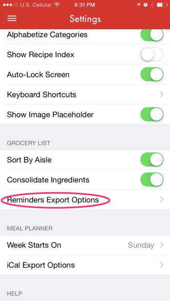
As I said in my last post, I like to use Siri and an app called AnyList to manage my grocery lists. Paprika works well with my system by letting me export ingredients from a recipe into a Reminder list, which then gets automatically sent to AnyList. To make this work you first need to go to Paprika's settings, select the Reminders Export Options, and set your list name to the one you use in the Reminders app (in my case it's named "Grocery").


Then, when you're looking at a recipe, click the shopping cart icon.

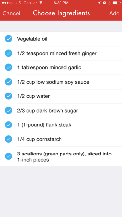
This will bring up a list of ingredients from the recipe. Leave the ones you need checked, and uncheck the ones you already have. Then click the "add" button. This will maintain a grocery list in Paprika (which actually could be enough for a lot of people's needs).


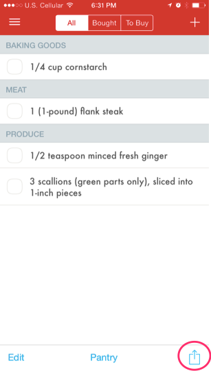
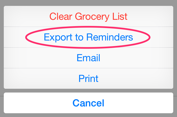
To work with my Reminders / AnyList system, I next go to the grocery list part of Paprika, hit the export icon in the lower right hand side of the screen, and choose the "Export to Reminders" option.


IMG_9228.png


This will send the list to my grocery list in Reminders, and it'll ultimately end up in AnyList (see my previous post for more about that).

One thing to note - exporting your grocery list to Reminders won't affect the list in Paprika. As a consequence, the next time you add a recipe's ingredients to your list the old ingredients will still be there, which you probably won't want if you've already bought those items and made that meal. To avoid this, I'd recommend clearing the grocery list after your export (this can be going through the same steps above but choosing the "Clear Grocery List" option).

As I type this out step by step I feel that it sounds really complicated. It really isn't, as this video will hopefully demonstrate.


So, whaddaya think? How go you manage recipes and grocery lists?

Posted
AuthorTodd Zarwell
11 CommentsPost a comment

I like Siri. It's far, far from perfect, and I think people hold it to a very high standard (it's easy to do when your basis for comparison is human intelligence). But there is a limited set of things that it does do well, and I find those things extremely helpful.

IMG_0088.jpg

Set a timer for 10 minutes (so I can kick the kids off my iPad).

Remind me to bring Drew's snowpants to school on Monday morning at 6:30.

Remind to place that order when I get to work.

Basically, it supplements my brain and helps me remember things I'm almost certain to forget.

Perhaps my biggest use of Siri, however, is managing grocery lists. This helps me in innumerable ways, which I will now outline. In a numbered list.

  1. I never forget to add something to a list. I use the last of the peanut butter, I pull out my iPhone, hold down the home button, and say "add peanut butter to my grocery list". Bam. Not gonna forget the PB.
  2. I always know what I need when I'm at the grocery store. I never have that nagging feeling that I'm forgetting something, and I never get home and kick myself for neglecting to pick something up. And my six year old never has to reprimand me for forgetting to pick up his apples.
  3. I always know what my wife needs at the grocery store, and she knows what I need. I might just stop in to buy donuts on a Sunday morning, but a quick look at my phone let's me know that Lisa just used the last of the garlic powder and I might as well grab that too.

Now, there's a few things that make this easier.

First of all, I have a list that's named "grocery". To do this, open the reminders and hit the "+" button to make a new list. If you open the reminders app and don't see the "+" button you might need to tap the area at the bottom of the screen that looks like a bunch of stacked index cards.

If you're looking at a list, click the bottom of the screen to see all your lists - and get the option to create more lists.

If you're looking at a list, click the bottom of the screen to see all your lists - and get the option to create more lists.


To share with your spouse, go into your newly created grocery list and click the edit button. Then click the Sharing opinion, then Add person.., and find the person upon whom you'll bestow your list sharing privileges.


This all works very well, but we decided to take it to another level with a third party app called AnyList.  AnyList has a number of nice features, including:

  1. It separates your grocery list into groups such as "produce" or "meat" or "dairy". That way, when you walk through the grocery store, you can get everything you need in each section without having to repeatedly zigzag  back and forth throughout the whole store.
  2. It also has the option to share with a spouse and sync with desktop and browser apps.
  3. And, for my favorite, it can import lists from the built in Reminders app. In my case, from my Grocery list. This has the awesome result of letting you use Siri to populate your AnyList list. To import from Reminders, go to AnyList's settings and turn the "Reminder's Import" option on. Just make sure the name of your list in AnyList matches the name in Reminders (in my case they're both named "Grocery")


By the way, the things I'm describing here don't have to be limited to groceries. I've followed this exact same process to make a Target list, a Home Depot list, and a Costco list.  

Here's a short video on how I use the lists. The one thing that I don't include is perhaps the most useful feature of all: The fact that all these additions are almost immediately present on my wife's phone as well.


In my next post I'd like to talk about something very closely related to groceries: recipes. Stay tuned.

Posted
AuthorTodd Zarwell
CategoriesTech
9 CommentsPost a comment

I just finished Walter Isaacson's book, The Innovators. You might remember Mr. Isaacson as the the man Steve Jobs approached and ultimately convinced to write his biography, but he also wrote a couple excellent memoirs about Benjamin Franklin and Albert Einstein

The goal of The Innovators  is to walk us through the major advances in computer science that brought us to the technology that we enjoy and love today. 

In my opinion, the most fascinating part of this evolution begins in the 1840's, when Ada Lovelace essentially mapped out the steps that are used to write a program computer program over 100 years before engineers could actually build a machine capable of running a program.

The book then moves on to discuss vacuum tube computers such as Eniac, the development of the transistor, the development of the microchip, the invention and popularization of the mouse and GUIs, Bill Gate's software commoditizing hardware, and the explosion of the Internet. And, of course, the collaboration of countless innovators that fueled this revolution.

I've read a number of books (Steve Jobs, iWozNerds 2.0.1, Eniac, Weaving the Web: The Original Design and Ultimate Destiny of the World Wide Web) that discussed many of these individual topics, but The Innovators is a great summary of the age of computing from it's humble beginnings to the present day.


Posted
AuthorTodd Zarwell
CategoriesTech
Tagstech

I just released a new app to the App store, and is now available to download. It's a Park's Three Step app, similar to the one I have on the EyeDock website

It's been a long time since I made a new iPhone app. I wrote the original EyeDock and CLCalcs on a very early version of iOS (it was iPhone OS at the time). Back then, iPhones only had 3.5" screens and iPads didn't exist.

I've opened up XCode and modified those apps a few times since their inception, but mostly just to fix things. It usually worked like this:

  1. new version of iOS comes out
  2. Crap, my app doesn't work!
  3. Hurriedly,  with a thin sheen of sweat on my brow, try to fix app before I got too many complaints

My apps were pretty much like an old watch: I fixed them when they broke, but I broke out in a cold swear whenever I opened them up and looked at the insides.

I decided a few months ago I really need to make some changes to the EyeDock app. I don't like the way it downloads its data, it's not optimized for the 4" iPhone screens, and I really need an iPad version. 

I'd stayed tuned to the developments in iOS and knew that things were evolving rapidly. In light of Apples has added or changed their APIs, in conjunction with the major changes I wanted to make to my old apps, I thought it might be best to relearn the ropes. What better way to do this than to make a new app from scratch.

In conclusion, I bring you the Parks Three Step app. It's my first universal app (it works on both the iPhone and iPad). I too advantage of many of the new things that have come along with the last 3-4 versions of iOS, including parallax, blocks, autolayout, and ARC.  These things may not mean a lot to my non-iOS-developer readers, but this essentially means I'm caught up on the modern way of doing things.

Now time to rebuild that watch.


Posted
AuthorTodd Zarwell

Like everyone else, my family has acquired more and more mobile devices. We each have an iPhone 5, we have a iPad 1, a Kindle, and I have a Samsung Galaxy phone through work.  Unfortunately we need at least 3 different types of cables (lightning, 30-pin, USB) to connect these gadgets. When we try to charge them our countertops look like the snake pit scene from Raiders of the Lost Ark. 

I kept trying to buy different devices to resolve this problem. Power strips. Outlet covers with USB jacks built in. The list goes on. However, these things did nothing to solve my problem: I still had a lot of long cables going everywhere. 

Then it hit me that the mess was due to having a lot of LONG cables. If the cables were short things would be a lot tidier. After some brief Amazon searches I found the perfect hub for me, the Anker 25W 5-Port USB Desktop Charger

It has a nice 5 foot cord, so I can have one single cord that allows me to place the hub out of the way against a wall. It has specific ports for iPhones and iPads as well as Android devices. Most importantly, this means that the iPad port has the higher (2.1) amperage for faster charging (if you've ever tried to charge an iPad with an iPhone plug you'll notice that it charges very slowly).

To complete my quest for cable orderliness I bought some short USB lightningmicro-USB cables, and 30-pin (old iPad) cables from Amazon and Monoprice.. Below is the result.

Posted
AuthorTodd Zarwell
Tagstech